Showing posts with label Basic Grey. Show all posts

Monday, March 21, 2011

Pink Baby Mine

I have this darling baby sentiment that I bought about 4 years ago, proudly brought it home put it in my little stamp tub, and promptly forgot about. Yoish! Not a good habit to get into, and I'm making a concentrated effort to get using my older supplies.


I made this card using Urban Prairie paper from Basic Grey. It is so bright and cheerful and it's a favourite of mine for baby cards. I admit I like making girl baby cards more than boy baby cards. It is directly tied to my ribbon and bow obsession, I suspect! I love the look of the kind of bows I make using my bow easy and so they seem to make their way on to every card.

Thanks so much for popping by today! You really make my day shine.

stamps; baby love (stampendous)
paper; urban prairie (basic grey), coconut swirl, canvas white (bazzill)
ink; black soot distress ink (ranger)
accessories; white satin ribbon (offray), pretty in pink satin ribbon (SU!), border punch (martha stewart)

Tuesday, January 18, 2011

IHP is Oh, so sweet!!!

Happy Tuesday!!!  Today, the i {heart} papers design team has been challenged to make a wee treat bag inspired by the European Candy Store in Ottawa.  This is a gorgeous little place, and while in Ottawa this past summer we walked by it a couple of times, but it was closed and it was very awkward to get to because of the construction going on outside the front door.  :(

Anyhoo, it's so easy to be inspired by this gorgeous website and the pictures of this shop.  I decided to make a wonderful old stand by, the classic sour cream container.  Mine are HUGE.  I used the ratio of the classic container (4 1/4"x 5 1/2") to make mine with flat paper measurements of 6 3/8"x 8 1/4".  Yes siree!  Super size me, baby!!!


I used a terrific stand by from a couple of years ago from Basic Grey, Bittersweet, for my project.  The candy coloured sweetness of these papers is a perfect palette for a confection container.


I used a couple of Spellbinders dies for these tags; Fair Isle and circles nestabilities, and Kate has them on sale right now, making room for all the gorgeous new product that will be coming in after CHA.


While looking for a sentiment for these treats, I discovered these tiny little gems in the Everyday Adorable set by Unity.  Again, Kate has this set and some older Unity stock on sale.  Add a little pink bling and some hot pink silk ribbon, and voila!

We would invite you to play along with us by adding the tag ihp0111 to your post on SCS or PCP so we can find it.

Check out what the rest of the team did for sweet treat packages;
 stamps; everyday adorable (unity)
paper; bittersweet (basic grey), swirlpool white, carob creme (bazzill), kraft 
ink; pitch black adirondack (ranger)
accessories; pink rhinetsones (zva), fair isle pendants, circles nestabilities (spellbinders), silk ribbon (may arts), scallop border punch (SU!)

Sunday, August 1, 2010

CHA Peeks and Pics! Day 1

For all you subscribers, please note that I will be posting everyday until I run out of CHA pictures.  Don't let this drive you crazy in your inbox; be patient and I'll get back to my regular posting schedule soon.  In addition, I'll have a new avatar, watermark and blog banner in the near future so come on by my blog and peek at the renovations once they are done.  I'll have some blog candy for one lucky person who leaves a comment once we blow away the sawdust from the construction!

My CHA posts will be mostly pictures.  I'm sure you are fully capable of making decisions about what you will see, and I doubt you want my opinion on the product.  *grin*  So, hold on to your shorts 'cause CHA was one wild, fantastic ride!!!

Guess who had the booth *uber* close to the entrance?!!!


And here's pictures of all the new Basic Grey coming your way in your LSS or online store this fall;

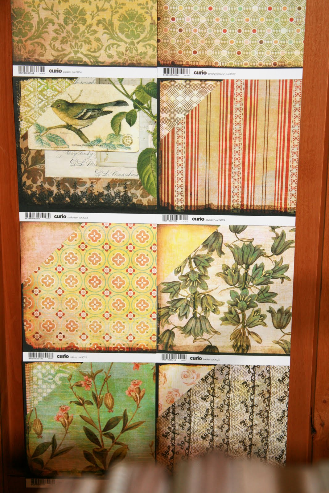
The Curio Collection;


The Jovial Collection;


The Marjolaine Collection;


The Pyrus Collection;


The Wander Collection;


Tomorrow, I'll post my favourite booth, simply because I can't keep it under wraps for long!!!

Thursday, October 2, 2008

While I have no love affair with black, at least there is no love lost anymore either! I will still choose brown over black if given a choice, but this absolutely de-lish new paper from Basic Grey removed all option for brown.

I figured out something absolutely fabulous. Forgive me if someone else discovered this first; I didn't know about it. I don't usually figure out techniques on my own, but necessity is the mother of all invention, and I was in dire need for this card.

I wanted to do pretty, frosty trees, but I had no grey craft ink and with the fine lines of this stamp, I was not even going to attempt re-stamping the image with versamark. That idea is just a disaster waiting to happen! I inked up my image with dye (classic) ink and then tried picking up versamark overtop. I got a partial tree trunk on my versamark pad. Not good! Then, I tried inking up the image with Versamark first and inking with dye ink on top of it. Ink on top of ink on the stamp. I stamped the image and then embossed. OH GOSH!!!!!!!!!!!!!!!!! It worked. I'll be showing this fabulous trick to my hostess ladies a little later this month. I felt brilliant for a moment - then life knocked on my door, and I was just me again...

stamps; lovely as a tree (SU!), Give Thanks (by Anna Wight for Whipper Snapper)
paper; elephant, raven, coconut smoothie (bazzill), Ambrosia collection (basic grey)
ink; going grey, baha breeze, soft sky, basic grey (SU!), versamark (tsukineko)
accessories; irridescent ice ep, balck grosgrain ribbon (SU!), square rhinestone brads (making memories)
Related Posts Plugin for WordPress, Blogger...