Showing posts with label mo manning. Show all posts

Thursday, November 22, 2012

Warm Fuzzies and Happiness


And for today, a darling little Christmas card. I just know I won't get all my cards made this year. There aren't enough hours in the day for it to be possible. However, I will do what I can, and likely buy a box of cards for the majority of what we send out this year. *Ugh*


I coloured my image using copic markers and sponged the edges since it felt a little too barren without.


I used a lovely sentiment from Sentimental Christmas by Flourishes to create the greeting banner. I do love this set.

See you soon!

stamps; image (mo manning), sentimental christmas (flourishes)
paper; jovial (basic grey), kraft, brown (bazzill), x-press it (copic)
ink; gathered twigs, pumice stone distress inks (ranger)
accessories; hemp twine (unknown), button (basic grey), copic markers

bella & bronte - don't be square

Sunday, July 1, 2012

I'd Miss You

Connie, from Riddersholm Design, has some stunning papers - the shabby chic style is right up my creative alley! I've pulled out some from her 'Fleamarket' line to use today.


I got my inspiration for this card from my daughter Hannah, and her darling, wingnut dog, Opie. In my previous post, Hannah washes puppies. This is the blog post I did all about Opie when we decided to adopt her. Since then, if you didn't know she was deaf, you could hardly tell! She is very timid around new people, and when people talk to her, she doesn't respond. Beyond that, she is a fantastic dog! We regularly work on her training and she does insist on getting up at 6am to Tigger bounce into the new day, every day!


This Bronte Kisses image is perfect both for Hannah with Opie and for the sentiment. I coloured it using my sorely neglected copic markers; E0000/00/01/08/09/11/13/17/18/24/27/97/99, YR24/27, V91/93/95, R85, B00/14/16/18, T0/1/3, W00/0/1/3/4, colourless blender.


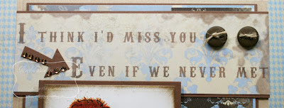
This sentiment printed on the Fleamarket paper was just too perfect for this card to pass up! I think it is now one of my favourite sentiments ever.


I hand cut this little arrow and dolled it up with a few adhesive jewels. Not bad for a hand made embellishment!!


Finally, I used some gingham ribbon and thin twine for the bow, both from Riddersholm Design.

Happy Canada Day!!

stamps; bronte kisses (mo manning)
paper; fleamarket (riddersholm design), kraft, carob creme (bazzill), blending card (copic)
ink; pumice stone, gathered twigs (ranger)
accessories; lg & sm squares (spellbinders), copic markers (copic), buttons (maya road), walnut adhesive jewels (bazzill), ribbon & twine (riddersholm design)

digi makeover - use a digi
totally papercrafts - use a digi
tuesday throwdown - use gingham
phindy's place - inspired by a song ('How much is that doggy in the window')
the kraft journal - anything goes
wags & whiskers - use kraft
papercrafting journey - use kraft
love to create - anything goes

Saturday, January 21, 2012

Love Ya!

I haven't coloured in almost a month and I was starting to suffer a little withdrawal, so I set aside the books to do something a little more creative today.


I took my main inspiration from this week's Deconstructed Sketch and the colour challenge from Splitcoast. The rest of my challenge inspiration is listed at the end of this post. There is a long list of inspiration which I'm thankful for, since my creativity needed a little jump start after being abandoned by the side of the road for the last month.


I have had this 'Love Ya' image by Mo Manning printed since last June. It has been sitting in my printed and stamped image file along with some images that were printed more than a year ago. Time sure can get away from me when I'm not looking!!! I used Stardust stickles on the background and I do love that darling, magical sparkle.


I have seen paper buttons on various cards, and it was a technique challenge on SCS awhile ago, and I'm thrilled I had a chance to give it a try today! I die cut 6 identical hearts using the Hearts Nestabilities die from Spellbinders and glued them together. I punched 2 holes with my crop-a-dile and gave it a good coating of Glossy Accents by Ranger. Note to self, grab a little patience and wait until the glossy accents is completely dry before touching;


That is such a clear fingerprint that it could be used by the police for identification purposes!!! I tied a bit of Brown Sugar Divine Twine and stuck a little floral embellishment on it.


I saw this sentiment and promptly typed it out and enlarged it for this image. It pixellated when I printed it, making it look a little fuzzy, because I am really not a digital designer. Looks pretty good in the photo though. And it is so perfect with this image.


Copics used today; W00/0/1/2, E000/01/11/43/44/71, YR000/20/21/24, R000, RV00/21/23, colorless blender

stamps; love ya (mo manning)
paper; bittersweet (basic grey), brown, canvas white, pirouette dotted swiss (bazzill), x-press it blending card stock (copic from ihp)
accessories; lg & sm classic circle, lg scallop circle, heart nestabilities (spellbinders from ihp), brown sugar twine (divine twine by ihp), stardust stickles, glossy accents (ranger from ihp), floral embellishment (recollections), crop-a-dile (memory keepers)

colour challenge scs - pretty pink rose with dessert option button & heart (cc358)
technique challenge - paper buttons (tlc325)
technique challenge - twine it up (tlc360)
deconstructed sketch - #35 
pile it on - fuzzy friends
stampin for the weekend - out with the old
anything goes - anything goes
poodles parlous - valentines/love
memories of time - be mine bingo (glitter, heart, glossy accents)

Friday, October 15, 2010

Ballerina Fairy

I purchased some paper that is completely new to me.  Never used anything like it before, and I've had some sitting around because I haven't invited it into my comfort zone.  I'm talking about the notebook/journal pads of paper.  I have some from both Bo Bunny and Making Memories.  I love the colours of them, the shapes of the framed edges and it tickles the creative part of me, but when it comes down to the nitty gritty, I'm not a scrapbooking journaller and I haven't had much success using them in my stamping.  I decided to pull a pad out and see if I could make it work.


I really like this new Christmas journalling pad from Bo Bunny.  I chose a paper that has - get this - purple and teal poinsettias!!!  There is one little purple snowflake visible over the fairy.  These are fun papers and I like the colours in this pad.  They will make for fun Christmas cards for the girls in my youth ministry life group, but they aren't what I normally use for Christmas.


I coloured this cutie patootie darling ballerina fairy from Mo Manning's Little Fairies collection (love her images) using copic markers.  It was brutal to get the spica glitter to show up on the picture, and I still don't think I was able to capture the gorgeous, subtle shine this girl has IRL.  I'm quite pleased because I hadn't coloured a brunette before this little fairy, and I think it turned out quite well.  Way to grow, eh?!!!  I used crystal stickles on her wings and, once it was dry, I used Ranger's glossy accents over top, which is a favourite technique I use for fairy wings.

Enjoy your day, people.  It was +23C (75F) here yesterday, and today it's snowing.  I need to get a couple more puppy pictures so we have 2-3 of each of Snow White and the boys and then they'll be on the website ready to go to their forever homes.  I'm not sure how enthusiastic they are going to be about the cold and snow, but we are going to find out this afternoon.  Ta!

stamps; Little Fairies (Mo Manning)
paper; noteworthy winter joy (bo bunny), phoebe (basic grey), coconut swirl, geneva, sprout, mist (bazzill)
accessories; crystal stickles, glossy accents (ranger), petite ovals lg, labels 4 nestabilities (spellbinders), dew drops (the robin's nest), stardust glitter pen (sakura), atyou spica pens (lilac, mint, buttermilk), copic markers

Wednesday, July 14, 2010

Baby Fairy Blue Hair

Since I first joined a digital image design team (Sugar Creek Hollow) last January, I have come to really enjoy the flexibility of digital images.  Initially, I was terrified because I have questionable tech skills and I wasn't sure how I would cope not knowing how use and alter these images.  My tech savvy oldest daughter patiently showed my how manipulate these images in Wordperfect.  Cool.  Later this summer, I will graduate to using a photo altering program that I downloaded for free from the internet and I can't for the life of me remember what it is called!  OY!

Some of my favourite digi images are from Mo Manning.  That girls has got a gift for capturing life and emotion in her images.  I do love whimsy, so I used Baby Fairy Yuriko for this card;


I think I have license to colour her hair blue because she is a sweet, imaginary creature.  I used copics and prismacolours on this image for a little more textured depth than I would be able to achieve using copics alone, and better coverage and saturation of colour if I had used prismacolours alone.  It's a happy balance!

Enjoy your day and thank-you so much for stopping by today!

stamps; baby fairy Yuriko (mo manning)
paper; coloured cardstock by core'dinations, coconut swirl  (bazzill), happy day (sei)
accessories; storybook cricut, flower fantasy cb folder (provocraft), oval nesties, lotus pendant (spellbinders), green crepe ribbon (creative impressions), white ribbon (offray), diamond stickles (ranger), rhinestones (heidi swapp), copic markers

Thursday, April 1, 2010

April Calendar

Happy April! I got my April Calendar done in a timely manner this month. Yay!!! I do really work at staying on top of deadlines but it doesn't always go in my favour! *grin* So, just to refresh, here are links to January, February and March. And now for a full shot of April;


I love the way this calendar is holding up. By now, my calendar has been taped around the hanging hole and the year has hardly begun! This year, it still looks awesome and I think it'll hold up beautifully until the end of the year. The picture portion of the calendar is 8 1/2" x 8 1/2" and will fit in a shadowbox style frame that I have from Ikea once I remove it from the calendar as the new month starts.


I had to re glue the Tim Holtz corners once, and I suspect I'll need to again before the year is out. I used Tombow metal glue, and it just hasn't been holding the corners the way I thought it would. I think this is a small complaint over all, and I'll have the opportunity to experiment with some other adhesives. Any suggestions?


I think April is my favourite calendar image so far. I'm really pleased with how it turned out. I used my cricut stone script cartridge to cut out 'delight'. I must say I like this font/cartridge far more than I thought I would! To reinforce the sentiment, I included a cute definition of the word. That little portion covered up a booboo as well - When I took the cap off one of my copics, the ink flew off the nib and splattered my image. I nearly cried because I was only adding the last couple of touches and had already put in some serious colouring time. I used my colourless blender to disperse the smaller splats, but there was one really big one that wouldn't fade! {insert embellishment opportunity} I decided that would be the perfect place for the definition.


I coloured the image with a base layer of copic markers and all the shading and texture is added using prismacolours. The red balloon really pops against the layers of this calendar image because I wanted the joy of this simple childhood pleasure to be the focal point and for all other elements to support this thought.

This card, by Amy Sheffer, was my inspiration for my layout.

Thanks so much for popping by today. It always means so much to me when you leave your comments and thoughts for me.

stamps; define your life (SU!), Cody's balloon (mo manning - digi stamp)
paper; origins (basic grey), coconut swirl, blackberry swirl (bazzill)
ink; black soot distress ink (ranger)
accesories; big scallop squares, square, labels 6, petite ovals nesties, jumbo scallop borderabilities (spellbinders), beetle black brads (bazzill), rhinestones (basic grey), stone script cricut cartridge (provo), copic markers, prismacolours
Related Posts Plugin for WordPress, Blogger...